
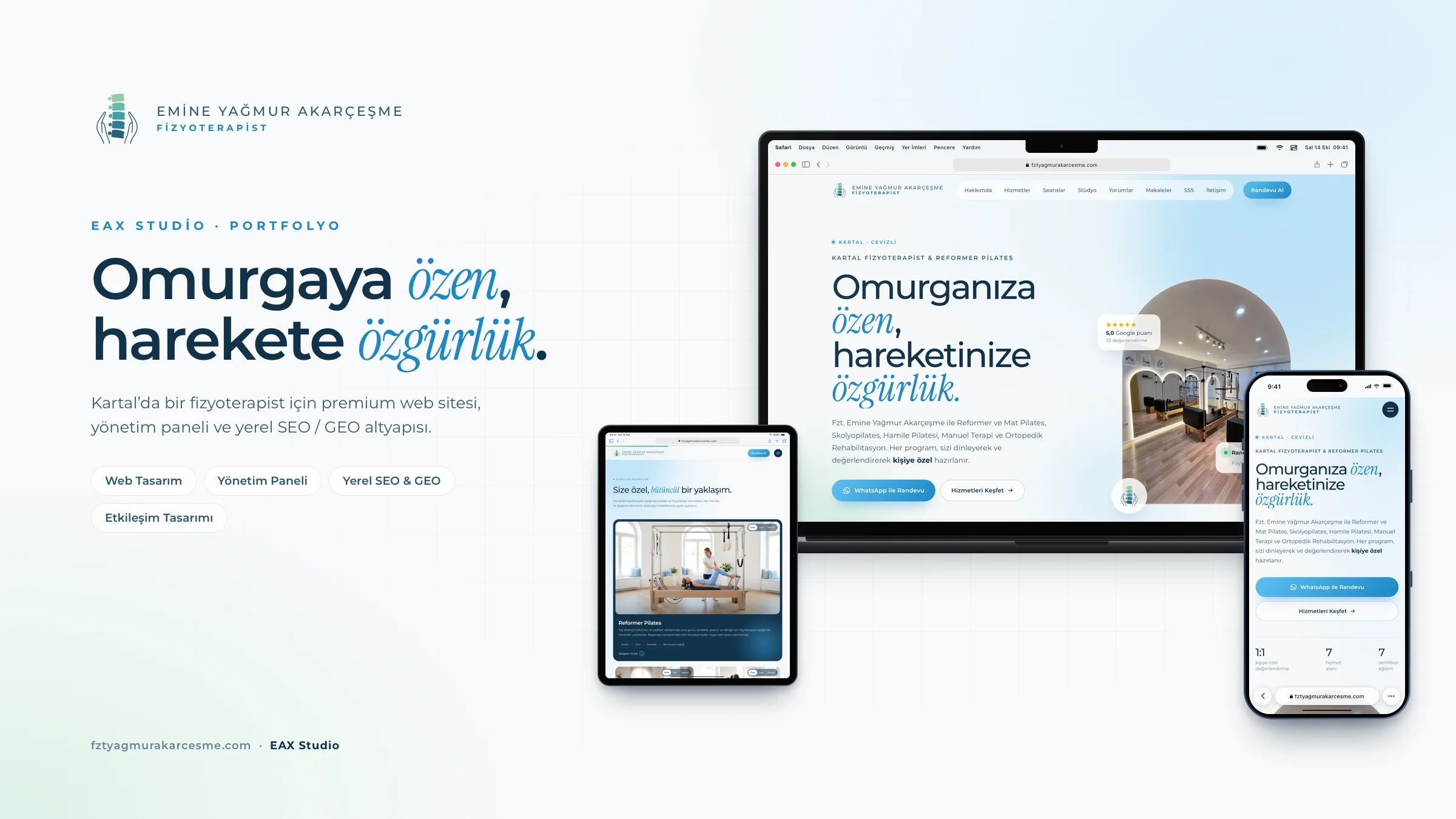


Fzt. Gülsüm Koç · GK Therapy Website, custom CMS and digital identity
Physiotherapy & Reformer Pilates · Kurtköy, Pendik / Istanbul
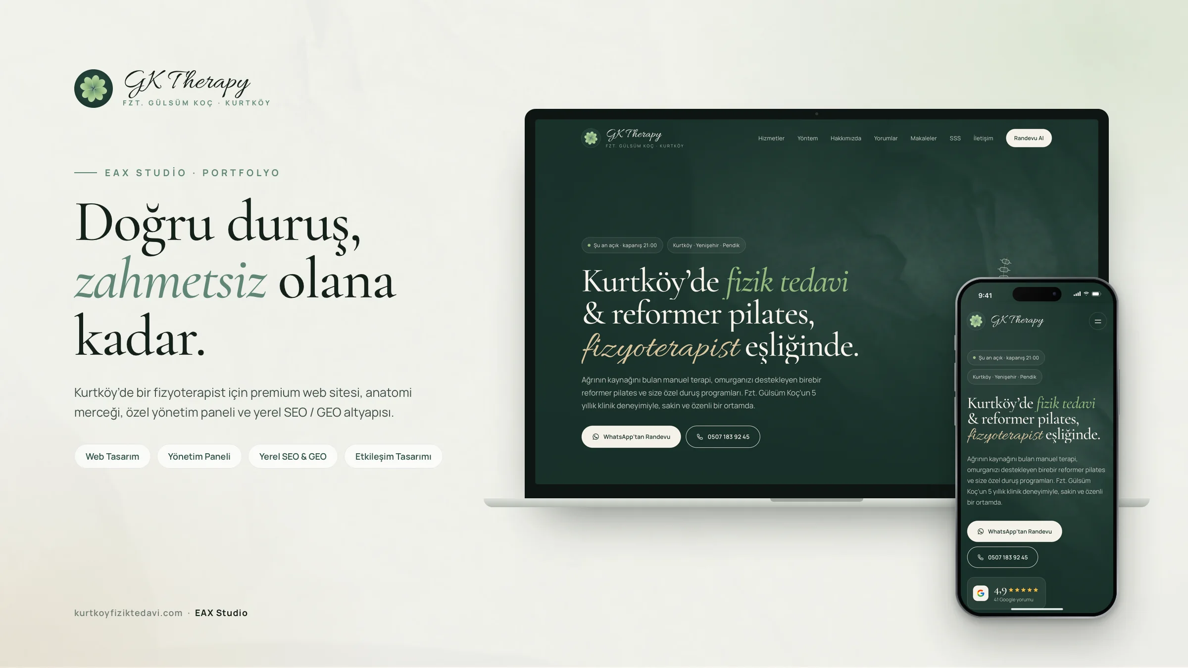
A calm, natural and trustworthy digital identity for a physiotherapist offering physiotherapy and reformer Pilates in Kurtköy, Istanbul. A premium website built around an anatomy lens that reveals the muscles and skeleton beneath each service photo, a spine that straightens as you scroll, and a custom admin panel the client manages directly.
- Sector
- Physiotherapy & Reformer Pilates
- Location
- Kurtköy, Pendik / Istanbul
- Year
- September 2026
- Services
- Web Design · Local SEO · GEO — Generative Engine Optimization
- Website
- kurtkoyfiziktedavi.com ↗
Chapter · Goal
Help prospective clients with pain or posture complaints build trust quickly, understand which service fits them and request an appointment over WhatsApp or by phone in a single tap — while being visible in local searches around Kurtköy and Pendik and in AI-powered search engines. Replace an expired old domain with a solid digital foundation built from scratch.
Chapter · Idea
How did we think?
Brand language
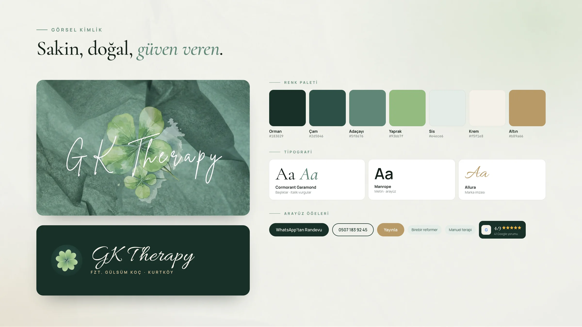
The watercolor clover and crumpled-paper texture of the logo were carried into the site’s entire color system: forest green, sage, cream and gold. Cormorant Garamond sets elegant headlines, Manrope keeps body text readable and Allura adds a handwritten brand signature. Paper texture and a subtle film grain create a warm, tactile feel rather than a clinical one.
Interaction
On the opening screen, a scoliotic spine straightens step by step as visitors scroll — the brand promise, visualized in the first second. Moving the cursor over a service photo opens a lens that reveals the muscles and skeleton at work in that area. The approach text colors in as it’s read, and the treatment steps advance with the scroll.
Ownership
The client manages contact details, opening hours, services, techniques, Google reviews, FAQs and articles from a dedicated admin panel — no coding required. Every publish is saved to a version history and can be rolled back in one click, and a built-in guide shows the relevant steps on whichever screen help is needed.
Chapter · Solution
Screen by screen.
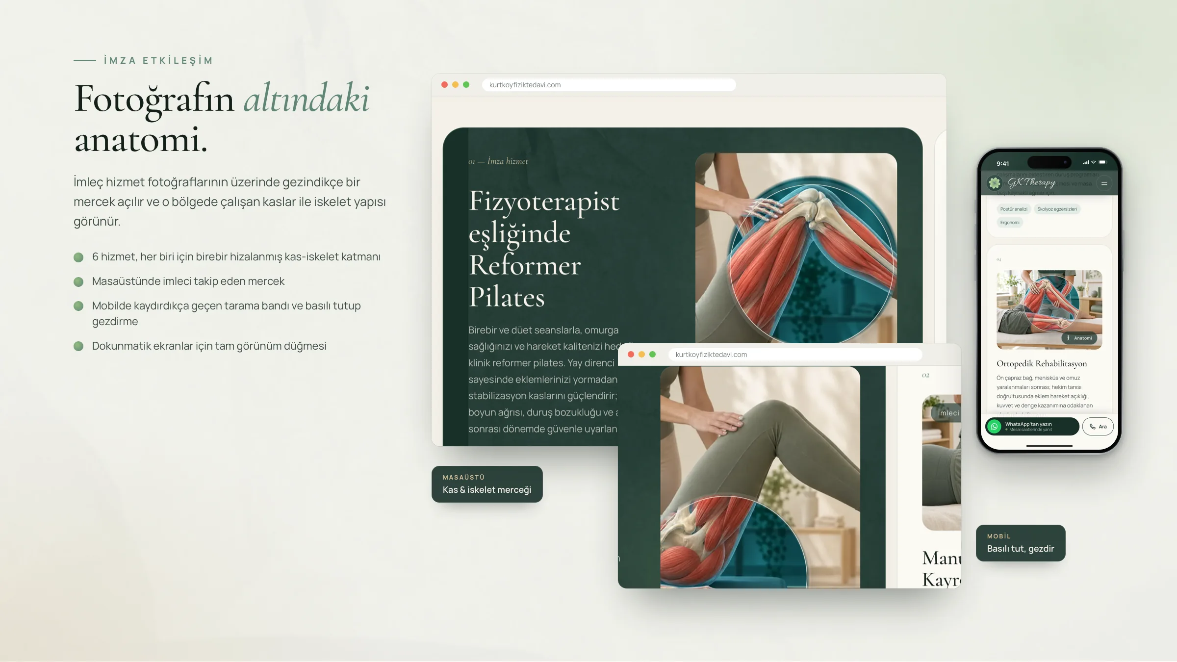
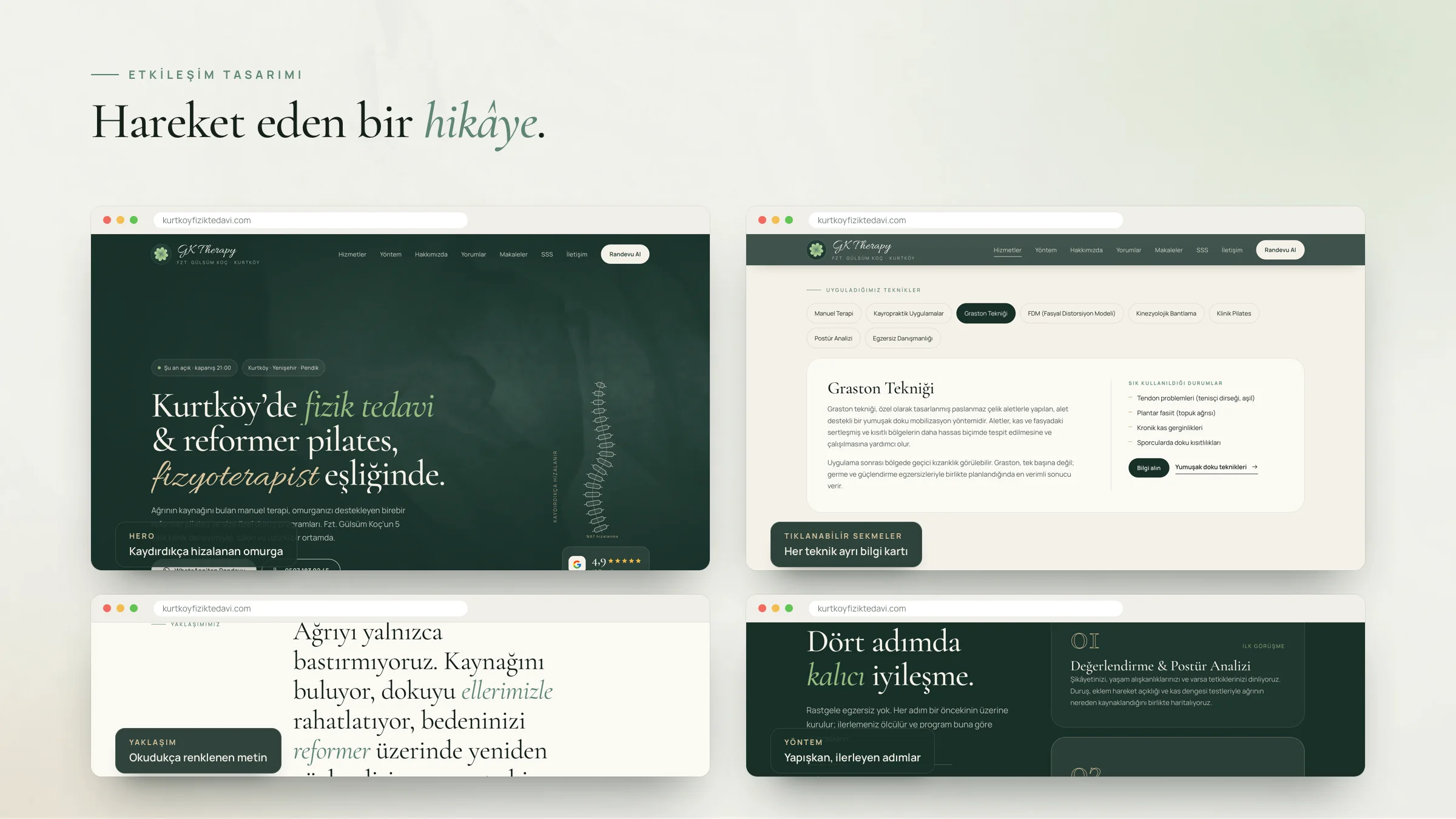
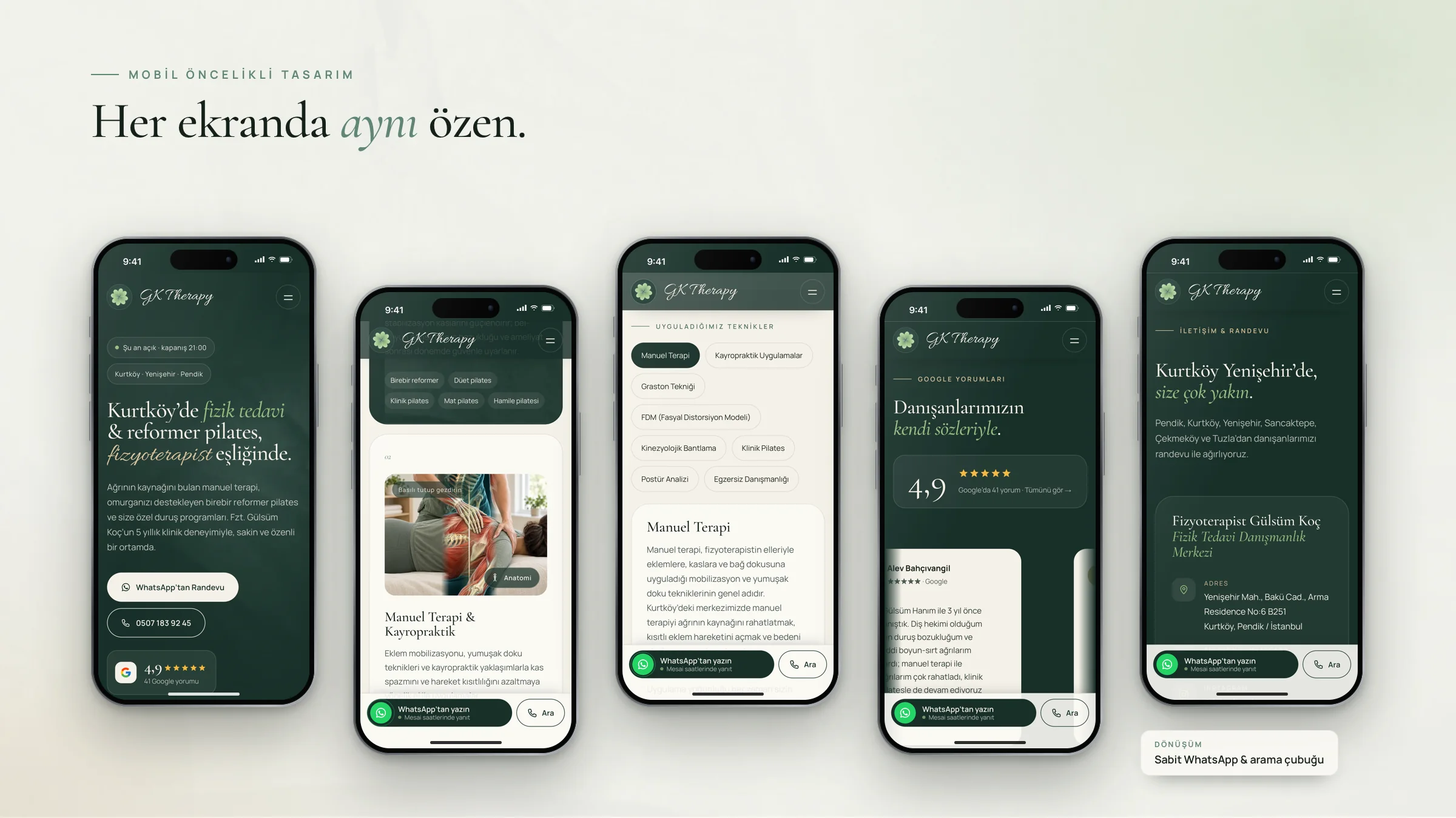
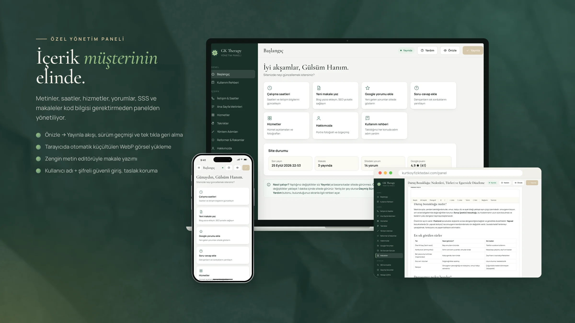
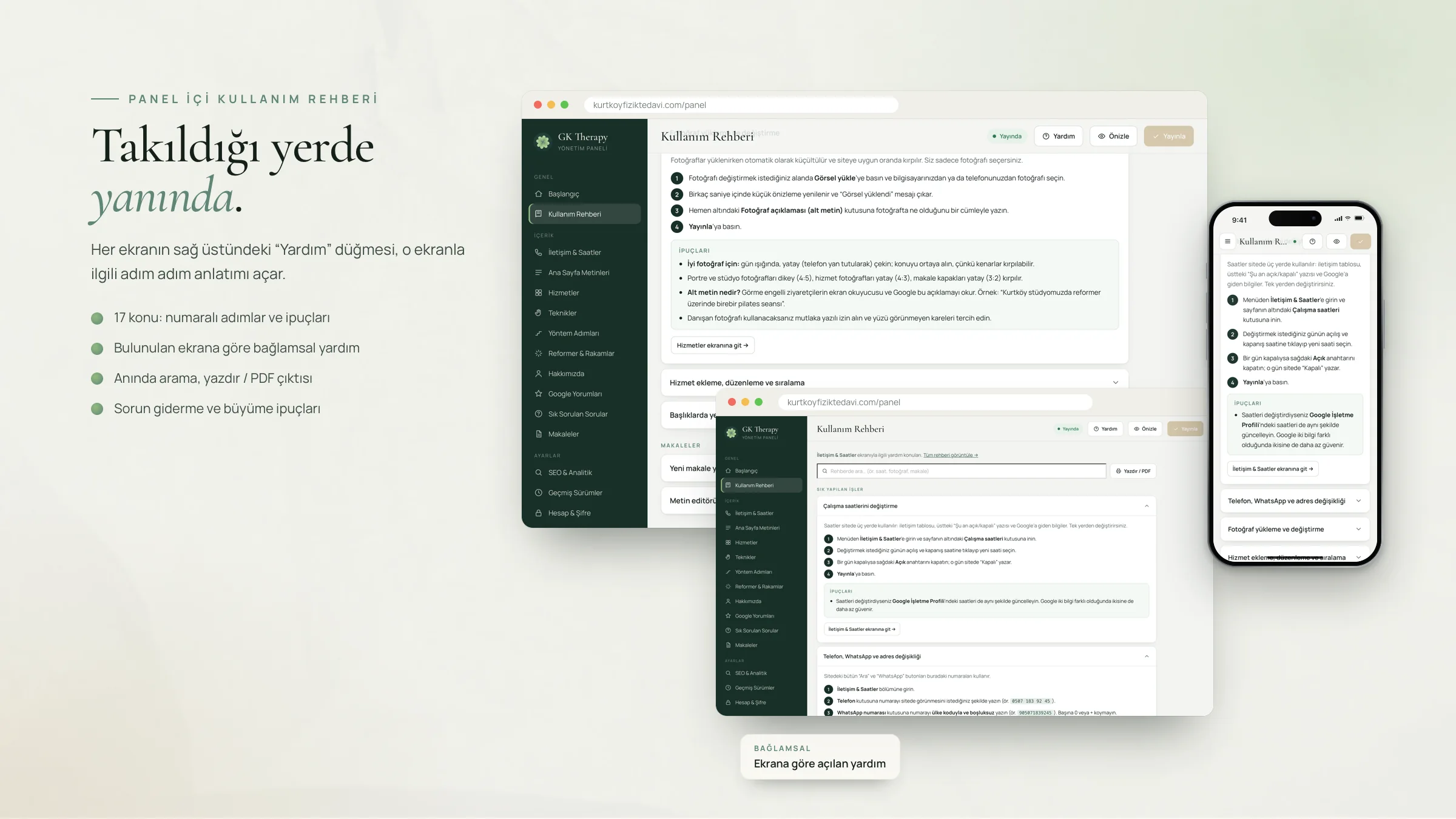
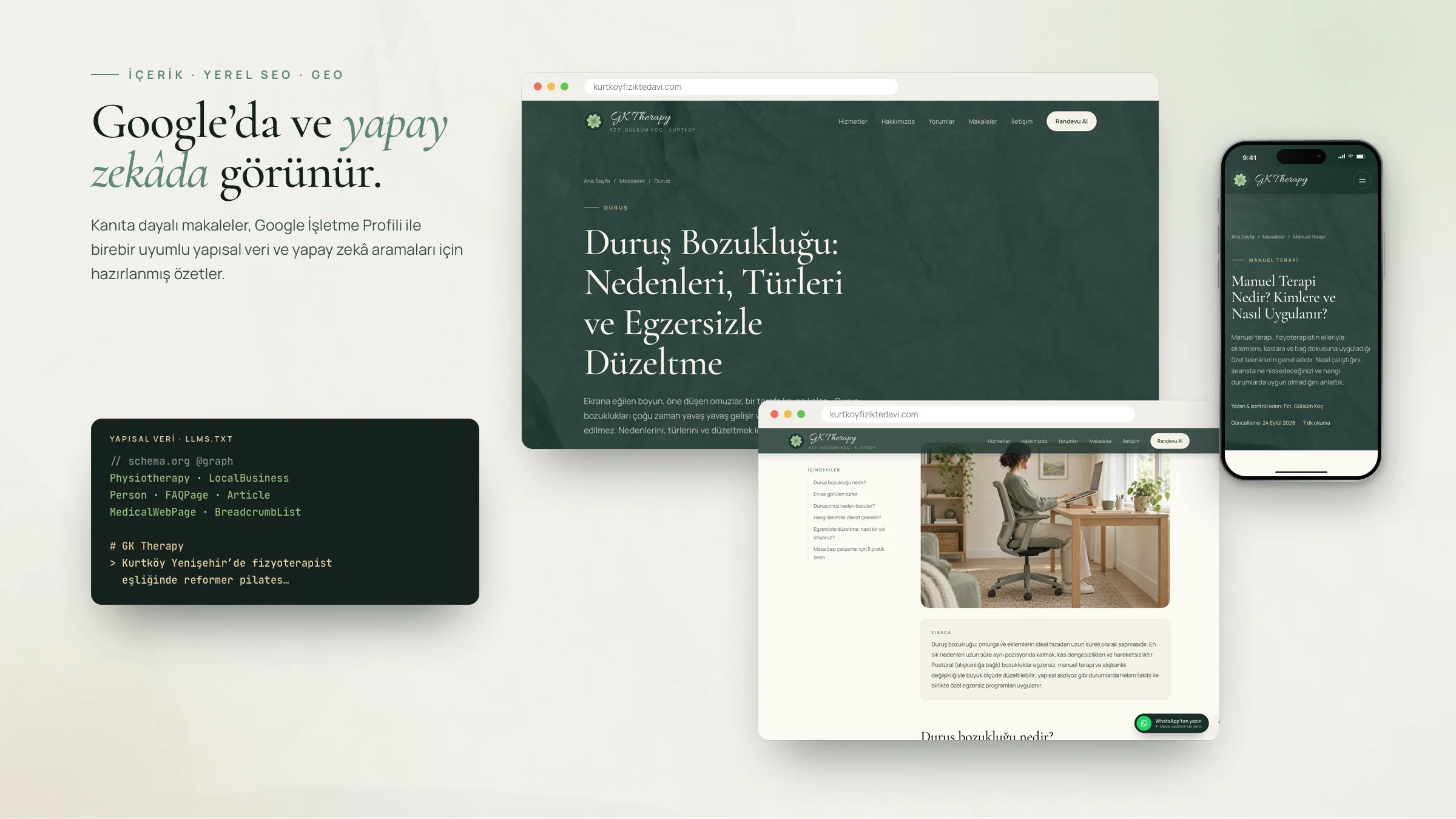
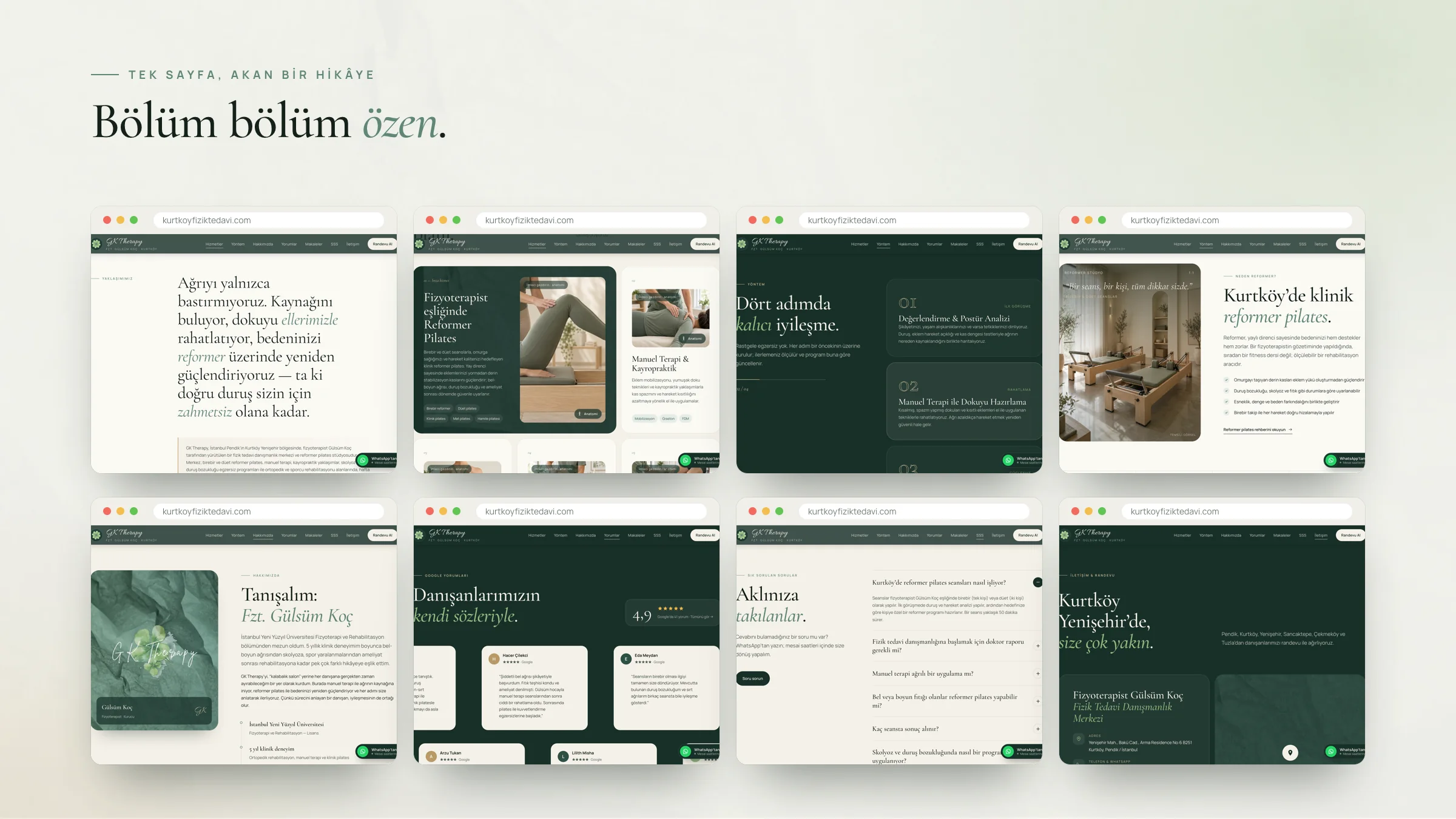
Interface text in the images is in Turkish, the client’s language. The service and studio photos on the site are AI-generated representative images, used until the real photo shoot.
Chapter · Details
Small details, big difference.
Clickable techniques
Each of the 8 techniques has its own info card for search engines and a shareable link.
Conversion-focused contact
A sticky WhatsApp and call bar on mobile and a live “open / closed” status based on business hours.
Evidence-based articles
Guides with references and a “TL;DR” summary; llms-full.txt updates automatically as content changes.
A spine that straightens on scroll
A signature animation on the opening screen that tells the brand promise.
Home page
From top to bottom.
Scroll inside the frame to see the whole page.

Chapter · Foundation
A solid foundation.
Found on Google and by AI
Search engines and AI assistants like ChatGPT can easily read and understand the site’s content.
Fast on every screen
Opens quickly on phone, tablet and desktop; the layout doesn’t shift while the page loads.
Self-managed
Text, images and services are updated from the client’s own panel — no coding required.
Secure foundation
The site and panel are protected with up-to-date security measures, and fake emails sent in the domain’s name are blocked.